Choosing fabric for a quilt can be tricky – especially when you’re doing applique!
When I showed the lovely fabrics I was planning to use for this free receiving blanket pattern, a couple of people said they were eager to see how I used the prints, since I usually stick to solids and near-solids.
The reason I usually stick with solids and near-solids is because they’re so much easier to work with! Especially for applique where you don’t want the design to get lost in the background fabric. It’s soooo easy to end up with a block that you’re not happy with!
So – here’s the fabric.
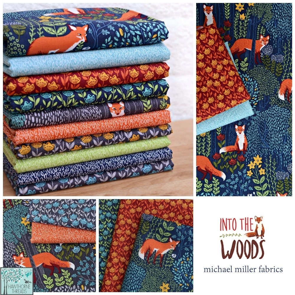
It’s the Into the Woods collection from Michael Miller Fabrics, sadly out of print now. But you’ll see a similar collection of fabric types in almost all quilt collections – some tone-on-tone small prints, some multicolored medium-scale prints, and some multicolored large-scale prints.
Gorgeous, right? Especially that larger scale print with the foxes and foliage.
But that’s exactly the print I didn’t want to use for my background. I used it for the back of the receiving blanket instead.
Why?
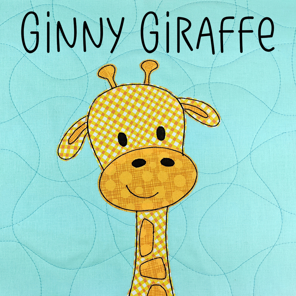
Because it contained all the colors I wanted to use in my applique fox face.
To show you why that would be a problem, I cut out a wonky little oval from the main fox color and laid it on that pretty fabric.
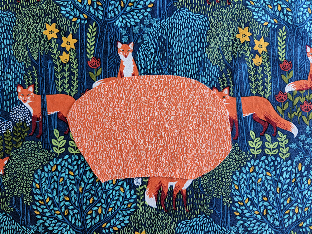
You can see the oval just fine, right?
Yes, but your brain is actually kind of fighting to see the oval. Your brain wants to merge all the same colors into one shape, so it actually sees a shape like this.
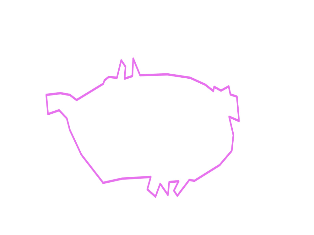
See?
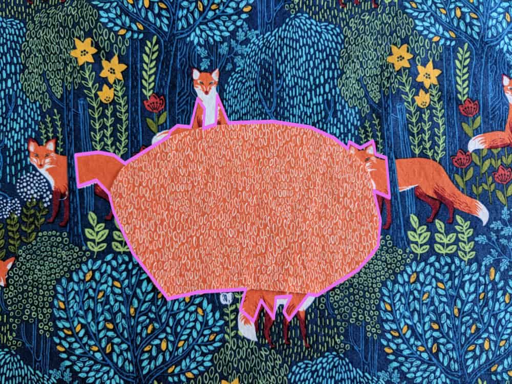
(This tendency is what makes it so much fun to play with negative space in traditional quilt designs. Your brain wants to merge those spaces together into new shapes.)
Again – you can still see the oval. It’s just that you’re having to overcome your brain’s natural tendency to see something else, and that will make for a less successful design overall.
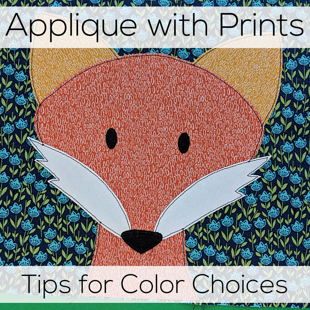
That doesn’t mean you can’t use fun prints. It just means that when you’re choosing fabric for a quilt, you have to pick your background very carefully. Here’s what I ended up choosing.
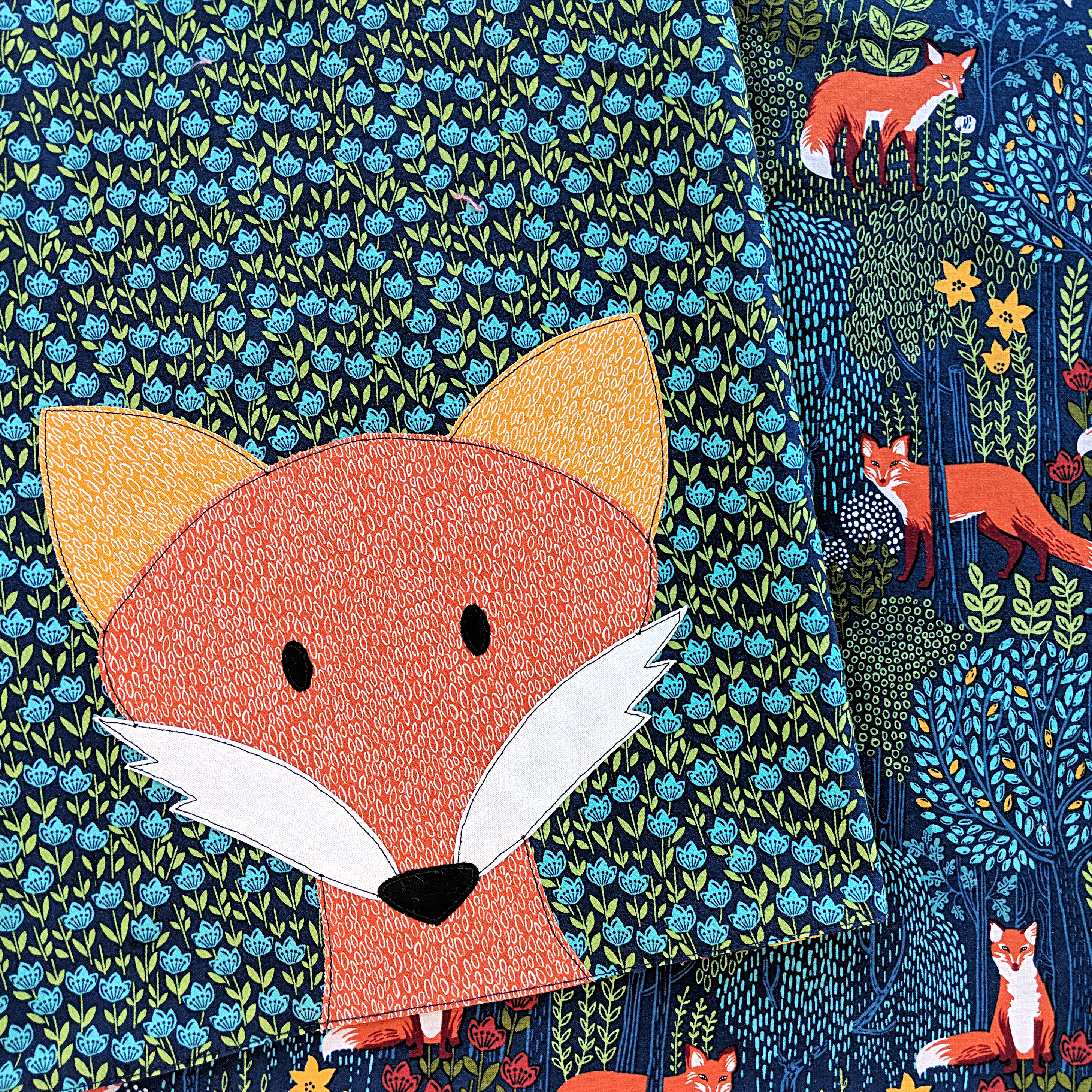
That pretty floral fabric I used in the background has dark blue, light blue, and green. No orange or gold or white – the colors in the fox applique. The green and gold are awfully similar – but ultimately I decided they were different enough for the combination to work.
And I still got that pretty fox and foliage print in there – just on the back of the blanket where it wouldn’t muddle the applique. 🙂
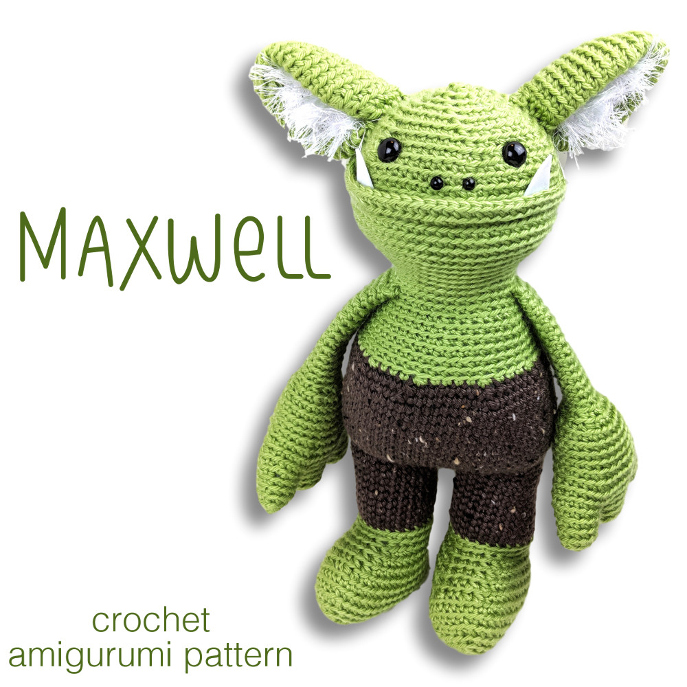
These color lessons apply to more than applique. Think about embroidering on a printed fabric, or using a print for a softie, or even a variegated yarn for a crochet amigurumi – the same color “rules” apply.
And if you want to make your own fox receiving blanket, the fox applique pattern is here, and the free receiving blanket pattern is here.

Here are links to all the posts about choosing fabric.
- How to Choose Fabric for a Quilt
- Using Fabric Print Wisely
- Applique with Prints – Tips for Color Choices
- Why Spoonflower Fabric
- How to Fill-a-Yard on Spoonflower
And here are links to posts about using specialty fabrics.
- Working with Flannel
- How to Applique with Shiny Fabric
- How to Applique with Satin
- How to Applique with Fleece
- How to Applique with Faux Fur
- How to Applique onto Faux Fur
Finished with this topic?
Return to the Let’s Make a Quilt main Table of Contents.
Happy stitching!

So Wendi would you recommend flannel fabric for applique or is its tendency to fray make it a bad choice?
I actually had the same question, so I tested it out! You can see the results of that testing here. https://www.shinyhappyworld.com/2016/09/working-flannel-fabric-durability.html