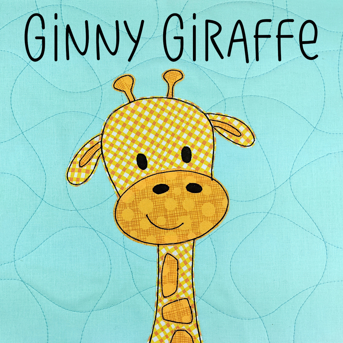

I get a lot of questions about how to choose fabric for a quilt.
I’ve got a post here with some tips for beginners on choosing what types of fabric to work with, and I include information with almost all of my quilts about the fabrics I used in my sample, but I realized I’ve never spelled out some general guidelines for choosing fabrics for a project – specifically choosing colors and prints.
Of course, choosing color is a pretty personal thing. 🙂 These are just the guidelines that I use to give my quilts their particular “look” and to make the blocks a cohesive collection.
First let’s look at the different groups I put my fabrics into.
Multicolor Prints
There are multicolor prints (fabrics that don’t “read” as a single color) which I hardly ever use. When I do, it’s often in a larger appliqué piece where the print makes sense, like this truck.

These fabrics are awesome and they make good quilt backs and doll clothes, but I rarely use them for appliqué, so I’m going to leave them out of this discussion.
If you really want to work with these kinds of prints, these two posts will help you out.
- Using Fabric Print Wisely – this post shows how you can use prints like stripes to do some of the work for you in an applique project
- Applique with Prints – this post has more info about choosing colors to pair with these multicolor prints
One-Color Fabrics
What I’m left with is lots and lots of fabulous monochrome fabric – which makes up the bulk of my stash. Within that group I have solids, batiks, and tone on tone prints (also called blenders).

When I choose fabrics for a quilt I work with these categories. I often start by choosing a category for my background blocks. I choose one of those groups and use those fabrics for ALL of the background blocks in a quilt. That makes the finished top look very cohesive.
Solids
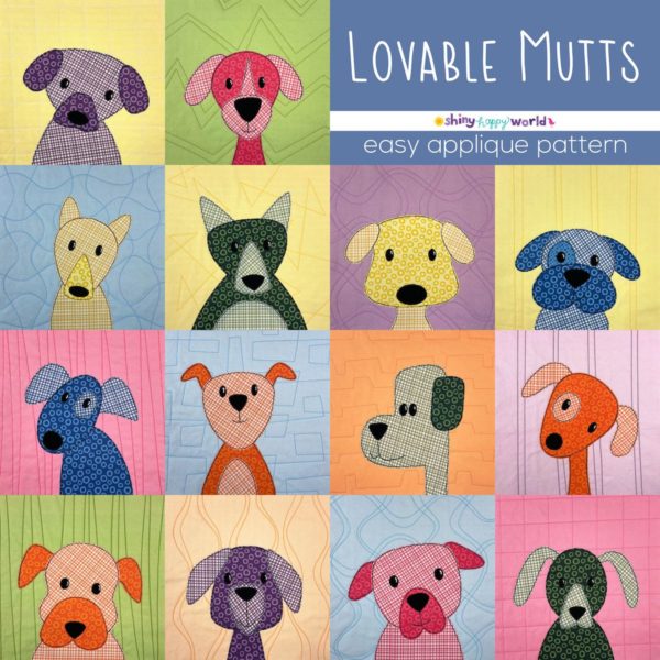
This sample of the Lovable Mutts pattern uses solids for all the backgrounds. The quilting REALLY shows up on these solid blocks, so this is my favorite choice.
I’ve got fabric especially designed for this kind of background blocks in my Spoonflower shop. They’re 12-inch squares of solid fabric with easy-to-follow quilting lines printed right on the fabric – grouped in handy color palettes. You can find them all here.
Batiks
This sample of the Chirp quilt uses batiks for all the backgrounds. The quilting will tend to disappear in the dapply batik texture, so choose this if you’re not very confident in your quilting skills, or don’t want to put a ton of effort into the quilting.
Blenders
This sample of the Woodland Critters quilt pattern uses tone on tone prints for all the backgrounds.
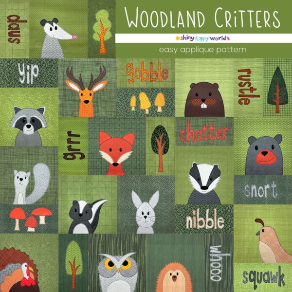
The quilting won’t show as much as it does on solid fabric, but it will show up more than it does on a batik, so these tone on tone prints are a good middle of the road choice.
I design LOTS of blenders especially for my applique patterns, and they work for both the background blocks and for the applique – which means they’re very versatile fabrics to have in your stash.
In my Spoonflower shop you can shop by color collection – like this collection of Gemstone blenders. This is a great option if you want to have a lot of different colors in your backgrounds, but you want them all to go together.
Another option is to go for a more monochrome look. You can shop by color and get pale to very dark shades of the same color, all in different one on tone prints. Here’s an example of the Amethyst collection.
That Woodland Critters sample uses all Avocado Blenders for the background blocks.
Choosing all your background blocks from one type of fabric helps create a unified look right from the start. But what about the appliqués?
How to Choose Fabric for Applique Quilts
For choosing those I rely on The Rule of Two Out of Three.
I look at three categories, and I only choose fabrics that have contrast in two of the three categories.
Texture
This is the easiest. Look at those categories of monochrome prints and choose two different ones. If you have a batik background block and solid fabric for the bird appliqué, you have contrast in the texture category. If you have a solid background block with a tone on tone print for the appliqué, you have texture contrast. Here’s a good example of that. . .

Temperature
This is also mostly easy. Warm colors are fiery – red, orange and yellow. Cool colors are watery – blue, green and purple.
Things can get tricky with neutrals – there are warm greys and cool greys, for example – but mostly this is pretty straightforward. If you have a cool background and a warm applique fabric (like that cat block above), you have temperature contrast.
Value
This one’s easy too. Dark fabrics contrast with light ones.
It can be hard to read the value contrast, especially if your fabrics are different temperatures. If you’re having trouble, try this trick.
These fabrics look high contrast because one is warm and the other is cool.

Snap a quick photo of them on your phone, then use a black and white filter on them.

Whoa! They have almost the exact same value!
Let’s audition some fabrics. . .
Even though that green/orange combination above turned out to have the same value, they still pass The Rule of Two Out of Three, so I would still use them. They have no contrast in value, but they contrast in texture (solid vs. tone on tone) and temperature (warm vs. cold).
How about this combination?

This one has contrast in texture (solid vs. tone on tone), contrast in temperature (warm vs. cool) and contrast in value (dark magenta vs. light green). It passes on all three categories, so it will be a very successful block. And by that I mean it will have enough contrast that the appliqué won’t get lost on the background fabric.
Here’s another one.

I love red and orange together, but this combination fails. 🙁 They contrast in texture, but they are both warm, and both relatively dark. They only contrast in one category, so I’ll try again.

This one passes! It’s the same red (photographed at different times of day and not color corrected) but paired with a much lighter orange. They’re both warm, but now I have contrast in texture and in value, so I know this is a combination that will work.
So there you go – The Rule of Two Out of Three. It’s how I choose all the fabrics for my quilts.
Want an even deeper dive into what colors go together? Check out Color Theory 101.

Here are links to all the posts about choosing fabric.
- How to Choose Fabric for a Quilt
- Using Fabric Print Wisely
- Applique with Prints – Tips for Color Choices
- Why Spoonflower Fabric
- How to Fill-a-Yard on Spoonflower
And here are links to posts about using specialty fabrics.
- Working with Flannel
- How to Applique with Shiny Fabric
- How to Applique with Satin
- How to Applique with Fleece
- How to Applique with Faux Fur
- How to Applique onto Faux Fur
Finished with this topic?
Return to the Let’s Make a Quilt main Table of Contents.
Happy stitching!
Pingback: CraftCrave | DigiFree | CraftCrave
This is VERY helpful! So glad to have read this before starting my Cat Quilt! And all of the others on my long Shiny Happy World list.
I’m so glad it was helpful! I know choosing fabrics for many people is the most stressful part of making a quilt. 🙂
Ms Elaine..
You talk about your long Shiny Happy World list, I do believe my list is growing too! I wish I had an endless amount of $$$, I would so buy Ms. Wendy out! Hahahaha!
Thanks Wendi, again you have given this novice important information. I love all the wonderful lessons and tips you provide!! Many thanks for writing the blog I turn to again and again.
Happy to help! 🙂
Hi Wendi,
I want to make a bicycle applique quilt. There will be one large, yellow bicycle on a background of grassy green, a brown path, blue sky, with appliqued white clouds and sun. This is for my 9 month old granddaughter and I want it to “grow up” well with her.
Could you please give me a few tips on selecting the fabrics.
I have the green, a strong tone on tone. The path is tone on tone medium brown, the sky is solid “sky blue”. I have several yellows: one has bright polka dots, one is a softer yellow with tiny red flowers, one is tone on tone yellow. I want to put a basket on the bike, with flowers flowing out of it and I don’t want the flowers to be “drowned out”.
Would you have a couple of suggestions for me. I know I am asking a lot!
I haven’t spent a lot on fabric, so would be quite happy to start over.
Thanks!
I think this all sounds great! For the yellows – choose the one that “pops” best against the background colors you’re using and think about the scale of the print. If the bright one with polkadots has really big dots – like wider than the frame of the bike – it might make your bike looks like it’s chopped in pieces. That’s one of the reasons I use tone-on-tone so much in my applique work.
If you want the flowers to really stand out, you probably won’t want to include any yellow ones. I don’t know if it will be green, or brown, or blue behind the flowers – but pick a flower color that is a complement to what’s in the background – maybe a bright red or a hot pink? That will pop really well against any of those background colors – and also against the yellow of the bike.
Have fun! 🙂
I appreciate the information on choosing fabrics for a quilt. I honestly had no idea how much went into choosing a fabric for a quilt. I would have thought that it was just the colors and that is all you really had to think about. I agree that there is a lot more that goes into fabrics and quilting and it can be hard to get used to and a lot to take in right away.
Really appreciate this post as I do hesitate to use the fusible and pretty fabrics until I build some confidence – so happy to have found your class and learn something new, your instruction and tips are inspiring me to give QAYG a try… thanks Wendi.
This is an excellent guide. It never even occurred to me. Its almost science! I would focus on colour and not consider anything else. The rule will be easy to remember. Thank you.
Wendi, thank you so much for all the excellent tips and information you share with us.
I LOVE your patterns and fabrics. Just ordered the Puppies Pattern.
Pingback: How to Make a Quilt - Shiny Happy World