At Rose City Yarn Crawl this year, I went to the Boss Kitty trunk show, and saw the most amazing mohair.
Neon green is my absolute favorite color, so I knew I had to make something out of this. I had already printed out the pattern for the Ivy Sweater by Petite Knit, and thought it would be a good choice. In a lot of her patterns, she holds a strand of mohair with her working yarn. I thought this pattern was one of them, but when I went to cast on, I realized that wasn’t the case.
For my base yarn, I used Cascade Yarns’ Friday Harbor in the color black. It’s a super soft wool and silk blend. When I first picked it up in the store, I thought it was an uber-soft cotton. It was the perfect non-fussy base to use with the temperamental mohair.
I was able to get gauge with one strand of mohair, my worsted yarn, and the needle size she recommended. My fabric was fairly structured, probably because of the added bulk of the mohair. I like that kind of fabric, but if you wanted something drapier, I would probably recommend not holding a mohair with the worsted, but your mileage may vary.
For my measurements, (bust 39 ¾) I made a size 5. I usually like my tops to be fairly form-fitting and I had to keep reminding myself that I was intentionally making something with a loose boxy fit.
When I tried on the top to test the body length, I almost frogged the whole project. I sent truly incredibly blurry photos to a friend—and former yarn-store co-worker—of mine. She was able to talk me off the frogging ledge, and reminded me that blocking fixes all sins.
See? I told you they were so blurry. I have a smart phone for taking blog-post pictures, but I use a flip phone in my day-to-day.
My main problem was the hemline. It sat where I wanted it to sit, but it was bunching up in an unflattering way. In addition to that, the hem was supposed to roll, which I liked, but it was rolling too much, which I didn’t like.
This stage of the process is also when I decided that I wasn’t going to do full-length sleeves. This has less to do with aesthetics and more to do with how hot I get in knit sweaters. This thing was already warm. Adding full sleeves would probably have me melting like the wicked witch.
One important thing to note. Fashion rules say that the sleeve hemline and the body hemline should be at different heights. This helps a finished garment not look super boxy, and also gives it some visual interest. When I decided to shorten the sleeves, I wanted to make sure I followed that rule. I chose a sleeve length that ended right above my elbow. It gave me more than a t-shirt, but less than a full sweater. Most importantly – that length wouldn’t chafe against my inner elbow.
After that, it was pretty much done! The only thing left to do was to weave in the ends and block it. I took pictures of the fit before blocking.
How I pinned it for blocking.
And….the fit after!
Honestly, I don’t love the fit.
It looks fine from some angles, but from other angles it drapes in a way that I’m not crazy about.
I’m thinking of some ways that I can cinch the waist in, maybe with some Chinese knots or a metal buckle situation. I love the feel and look of the fabric, so I’m definitely not giving up on this shirt, but I think I can add something that will improve the fit.
I don’t like wearing shorty socks, but store-bought socks with longer legs often cut off the circulation in my calves. I don’t know why – I don’t have especially large calves – but they do. The last time I found some that didn’t, I bought a whole bunch, but that was years ago and that batch is starting to wear out.
I needed new socks, and I can’t keep asking Jo to make them for me. 😂 I mean, she’s happy to make me socks, but I know there are other things she wants to knit, too.
Plus, I wanted a small project that I could carry around with me now that my sweater-in-progress is getting unwieldy.
So I knit a pair of socks! Jo helped me choose yarn and a pattern, and I was off to the (very slow) races. 😂
Here’s my yarn.
Jo recommends wool with a little bit of nylon added for durability, and I love Malabrigo, so I picked their Ultimate Sock Yarn in the color Indiecita. So pretty!
Jo helped me choose a pattern, too. I used The Ribbed Sock from New Wave Knitting. Jo has made me socks using this pattern before, and it has a very cool feature. You choose your yarn (pretty much any weight is ok), knit up a gauge, and then input that number into the pattern. The pattern then calculates everything for you! Magic!
I used double-point needles, which were a little hard for me to manage at first, but I got used to them. It just took me a little while to figure out the best way for me to hold everything comfortably – which is, I think, the story of everyone’s knitting and crochet life. 😂
And now I have a pair of socks!
I maybe didn’t do the best job blocking that lower sock, but ¯\_(ツ)_/¯ oh well. 🙂 They still look great on.
I’ve cast on for a new pair, also ribbed, but this time using a different kind of heel. I’m also trying 9-inch circulars (Stacey’s favorite method) instead of double-points. The jury is still out. It’s definitely faster now that I’m into it, but that first round was a beast with those itty bitty needles. Not even a little bit fun. 🙁 I’m also going to try the magic loop on my next pair, just to try all the options to see which one I like best.
I’m starting a class next week to learn how to draft a pattern from a finished garment, and this is the fabric I plan to use to make a copy of the purple dress in this post. It’s linen, so I still need to wash and dry it two more times before the class starts. (Lesson learned.)
I saw “I Saw the TV Glow” (try saying that ten times fast.) with a friend of mine, and we both loved it. Her birthday was a couple weeks ago, and I made this shirt for her as a birthday present. (Ignore that it’s two weeks late.)
I used all the skills I learned from the Silence of the Lambs shirt to make this one. Overall, I thought the process was much faster, and much smoother.
I based my design off the movie poster.
I chose the TV as the motif for the shirt. I thought that adding the silhouette of the person in front of the TV would make the shirt too busy, and having the bottom of the body randomly cut off in the middle would have looked weird.
I followed the exact same steps that I did for my Silence of the Lambs upcycled t-shirt, but with a TV instead of a moth.
I printed the pattern on Heat & Bond Featherlite, and fused the pieces onto the t-shirt fabric. Then I cut out the pieces and fused them to each other.
For the TV screen, I wanted a fabric that imitated TV static. I ended up getting two options for this. One was a heathered magenta shirt, the other was a pair of pink athletic leggings. I ended up using the leggings because the horizontal texture they had looked more like TV static.
I didn’t love working with this fabric, and I would suggest sticking to t-shirts if you were doing this at home. I felt like the athletic fabric was a bit thick for the needle—when I stitched through it, it felt gummy. Maybe using a ball point needle would have helped? But I didn’t think of that until the next day.
For my Silence of the Lambs shirt, I needed to have a backing piece of black fabric behind the moth design so that I could completely cover the design already printed on the shirt.
Here’s the t-shirt I started with.
Even though the motif is large, I probably could have covered the t-shirt design with just the TV, but I still opted to have a backing piece. You can see here that I just fused it to a rough black rectangle.
Sewing the TV to that backing piece made outlining the TV much easier. If I had just fused the TV right onto the shirt, I would be wrangling the shirt while I tried to do my precise outline.
Somehow, I didn’t get a single picture of the TV after I outlined it, but before I stitched it to the shirt. Hindsight is 20/20, I guess. After I did my outline stitching I trimmed the backing fabric to about 1/4 inch (maybe a little more) all the way around the edge, echoing the TV shape.
I ended up doing something a little funky with the thread for the outline.
Like the title suggests, in the movie poster, the TV is glowing.
I couldn’t make the fabric glow, but I was able to find some pink glow in the dark thread. It’s a peach color, which is not the bright magenta of the movie, but I was determined to make it work. I got a magenta thread that matched the fabric that I chose for the screen, and I used both threads for the outline.
Normally, for applique, I do three passes for the outline. For this project, I did four passes: two with the magenta, and then two with the glow in the dark. It still reads visually as very magenta, but if you let it charge in the sun for a bit and go into a dark room, the outline glows! (I tried to get a picture of the glow, but it wasn’t bright enough to show up on camera.)
With that, the front of the shirt was finished, and it was time to move on to the back. I wanted to put two things there—a quote from the movie, and an embroidered motif, also from the movie.
I had a vision for this shirt. For the quote on the back of my Silence of the Lambs shirt, I used whatever colors and letters I had. For this, I wanted to try and stick with one color theme. I picked letters that were all different shades of pink and purple and used them to spell out “There is still time.”
I sewed them down the same way that I did for the previous shirt, but with two new tricks. I made sure that the adhesive on the back of the letters went ALL the way to the edges.
I also remembered to change my needle this time! Last time, I hadn’t changed it after sewing through the paper of the fusible adhesive on the black backing. This time I remembered, and sewing the letters down was snarl-free.
I did forget one thing that I learned last time. In fact, I can almost guarantee you that I’ll forget it again, because I always do.
I didn’t use a press cloth when I started fusing the letters down, and I once again got plastic residue on my mother’s iron.
(It cleans off quick with a dryer sheet, but it still smells bad.)
The original post about ransom note upcycled t-shirts by Swoodson Says says to use a presscloth, and I said in my Silence of the Lambs post that you should use a presscloth. Even with all that, I still forgot again.
It wasn’t a huge deal, and with the presscloth I was able to fuse the letters down and sew them in place.
You may have noticed something else on the back of the shirt. A little ghost above the letters. This is the embroidered motif I mentioned. In the movie, this ghost glows on the backs of the characters’ necks. I thought it would be fun to embroider the same image on the back of the shirt. I really wanted it to glow pink in the dark.
I bought a glow in the dark braid that seemed promising. It looked great on the spool, but it didn’t work for this project.
The thread was thick and plastic-y. I expected that. It comes with the territory when you’re looking at glow in the dark stuff. Sadly, it just didn’t work with the t-shirt fabric. I couldn’t pull the thread tight on the t-shirt without the whole shirt bunching up, so the thread wouldn’t lay flat, and it made my lines look sloppy. I think that this thread would work great on a thicker, more stable fabric.
I ended up swapping to a magenta embroidery thread, and I think it looks much better.
And that’s it!
I’ve really been enjoying upcycling old t-shirts this way, and I was glad to have an excuse to make another one so soon. I hope my friend enjoys it! (Even if it is two weeks late.)
Yes – technically they’re pajamas – but pants are pants. Right?
We’ll get back to that.
I changed the pocket style from a seam pocket (I don’t like the way they gap open) to a set-in slash pocket. It’s an easy modification, and I’ll do a tutorial showing how the next time I make a pair.
I used a linen-viscose blend and they’re very soft and comfy – but they did shrink a LOT after I made them. Even though I washed in cold and hung them to dry, I lost a couple of inches in length after a few washes. I ended up taking out my double-turned hem AND adding a band of additional fabric from my leftovers to get them back to the correct length.
So I love the pants, and the color works well with both of my new dresses.
Success!
I wanted to make another pair, and that’s where things went off the rails.
I was poking through my archives to write one of my Friday newsletters and I found this fabric that I designed in 2023.
I LOVE THIS FABRIC! 😍
But I never used it for anything. 🙁
What if I made myself a pair of pants with this fabric? It’d look really fun under a black dress – which I don’t yet have but will make someday.
But what if I make a t-shirt with one of the birds on it? Then it’ll be like a cool coordinating set! It might be a lot of look, but maybe with a black cardigan to tone things down a bit?
So I had the t-shirt printed.
And I ordered the fabric for the pants. I ordered organic cotton sateen because that’s what I use in my quilts, and that’s what my bedding is made with. It washes up beautifully, the colors remain vibrant, and it’s super soft.
That was a mistake, but we’ll get to that.
I made the pants, really taking my time with all the finishes like French seams. They are a beautiful pair…
…of pajamas.
*headdesk*
How could I have gone so wrong?
I mean, I did use a pajama pants pattern.
And I did use a fabric normally used to make pajamas.
And that fabric does have a very pajama-ish print – especially in this context.
So how did I end up with something that looks like pajamas? 🤣
I addition to all that, the pants are HUGE! How are they so huge? I used the exact same pattern pieces I used for the linen pants.
You know, the ones that shrank so much I had to add more fabric to the hems. 🙄
Of course they didn’t just shrink in length! I measured the new shrunken-but-actually-fit-perfectly-now pants and they are a full size smaller than the newly-made tiki pants.
But the cotton isn’t going to shrink more after its single wash. They’ll soften up so they’ll hang a little nicer, but they aren’t going to get any smaller.
Maybe they’ll still work under a still-to-be-made black dress, but for now they’re strictly wear-at-home pants, which is exactly what I’m trying to get away from with the Wardrobe Project.
Chalk this one up in the fail column. 🙁
But I did learn things!
Wash linen multiple times before cutting it. I’ve ordered this fabric to make a dress and you better believe I’ll be sending it through the washer and dryer multiple times before I use it.
I can use a pajama pants pattern for regular pants, but maybe only in a solid color. The linen pants are still great, and I’ve ordered some black tencel twill for my next pair. Tencel twill is soft and has a really nice drape to it, so I think they’ll be great.
My next pair will be a size smaller.
I still need more dresses! I’ve decided to duplicate the purple one I’m wearing in this post, but it has pin tucks that only go partway down the front and I’m not sure how to do that – so I’m taking a class at Modern Domestic! It starts later this month and I can’t wait!
I saw the Miu Top by Una Gil on Instagram and thought it looked cute, so I made it.
Here’s the cover photo for the pattern.
This top is a little out of character for me style-wise, but I’m trying to upgrade my closet, so I want to take a chance on some new silhouettes.
It has a wider neckline than I normally like, and it’s a sleeveless top. I don’t like wearing sleeveless tops so I’ll probably always wear a thin layer underneath.
I spotted it at the Rose City Yarn Crawl this year, and I thought it was so gorgeous that I had to make something with it. These yarns are black wool marbled with another color. It gives them an almost black look, but in the sun or other bright light, the color is more visible. I originally wanted the color VCR, which was a nice green color, but they didn’t have enough in stock. I ended up going with Talk Radio, which is their purple.
It knits up well. It’s not a superwash wool, so it felts together pretty quickly. On the one hand, that makes a nice dense fabric, on the other, it’s a pain if you need to rip anything out. The yarn felt rough when I worked with it, but it blocked much softer. I have worn thin layers under the top when I’ve worn it out, so I’m not sure how itchy it is when worn against bare skin.
DISCLAIMER ABOUT THIS YARN. As pretty as it may be, I had major problems with it breaking. It didn’t seem like the kind of yarn that would break so easily. (It’s 3ply, not single ply, which is where I usually run into breakage problems.) The yarn broke twice when I was trying to cast on. It also broke while I was knitting when I was pulling some from the ball in my project bag. In addition to that, it broke MULTIPLE times when I tried to seam the shoulders. I ended up getting the seams sewn, but it took a few tries and an extremely gentle hand. On their website, someone left a review about breakage that seemed similar to what I experienced, and the company responded saying it wasn’t normal. Maybe I just got a bad batch. Honestly, the colors are so pretty that I would still work with it again, I’d just be mindful of the breakage and be cautious from the beginning.
The top itself worked up quickly. It’s worked bottom up. The waistband is worked in the round until you get to the underarms, then you split the front and back and work them flat. Once you work the front and back to the length that you want, you seam the shoulders and you’re done!
Overall I like the fit. I made a size medium, and I used two full skeins, and then part of a third.
I’m still undecided about the wide neckline.
I might go back and sew up a bit more of the shoulder seam (although I don’t know if I want to fight with the yarn again).
Final review…
The pattern is great – easy to follow, very adaptable, exactly what the cover image shows. I’m not 100% sold on the silhouette for me, but that’s nothing to do with the pattern itself.
The yarn is lovely and the color is beautiful. I’d use it again, but with caution in case the breakage issue wasn’t a one-time weirdness.
Friends – I chose a boring pattern. Truly, the most boring pattern ever.
Let me back up. . .
A few years ago I decided I wanted to learn how to knit. Jo (my daughter and now also my business partner) is an excellent knitter, and she offered to teach me.
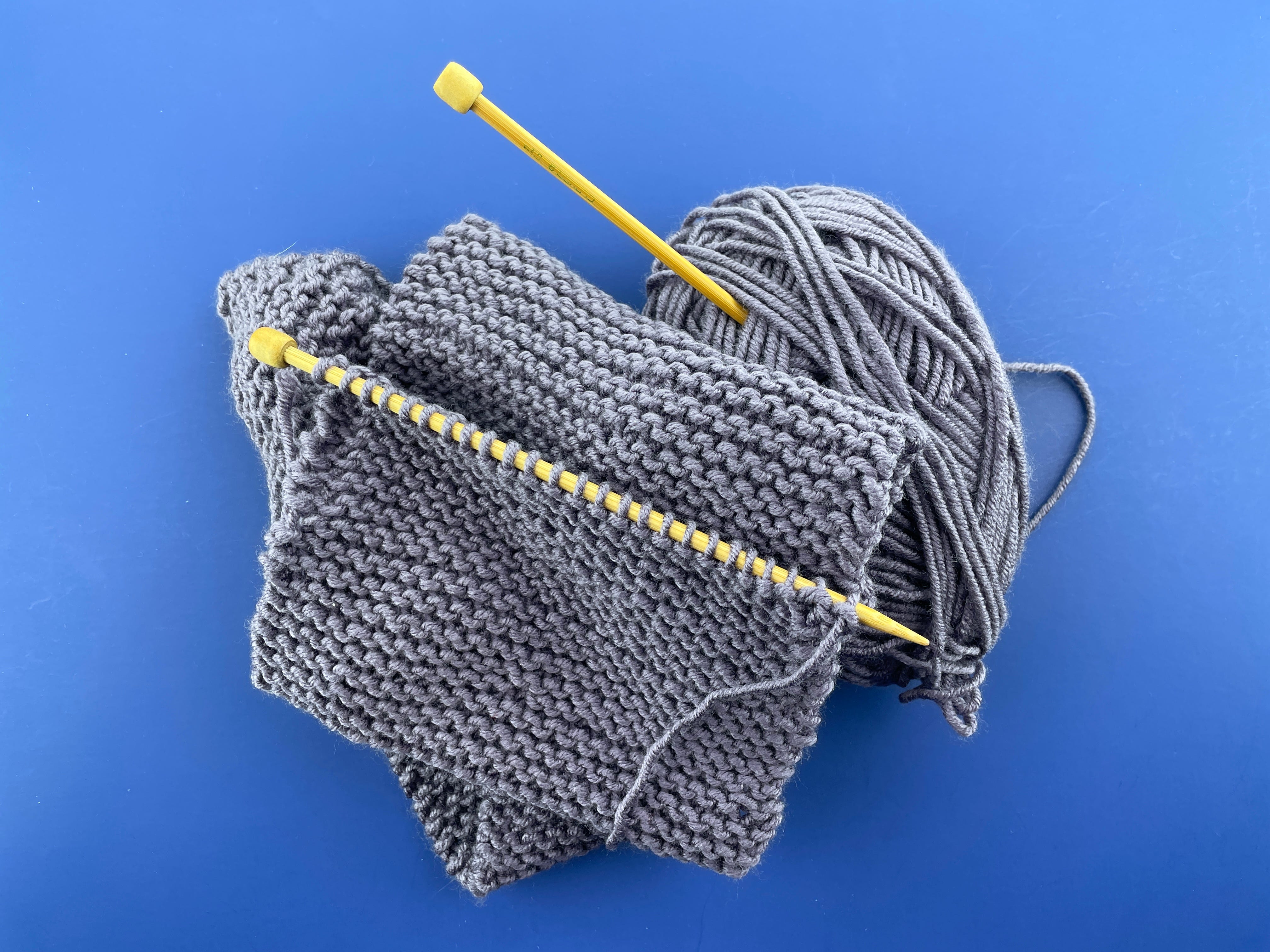
I bought some inexpensive-but-nice-feeling yarn and started to make The Most Boring Scarf in the Whole Wide World.
It was just knitting back and forth. Endless knitting. Boring knitting. That photo above is my progress after, I think, three years.
Yawn.
I don’t even wear this kind of scarf! I was making it just to learn how. There was nothing exciting about the thing itself.
This year [this was in March 2025] I decided to try again.
I chose the Sophie Hood, a very popular pattern from Petite Knit. It’s an intermediate-level pattern, with increases and decreases, and a built-in i-cord edge. I decided to complicate things even more by adding a second yarn and striping them. Some experienced knitters were dubious about choosing this for a first project, but it’s a thing I’ll actually wear, and I know I’m a patient learner. I’m okay with stopping to get help/watch some videos whenever I need to.
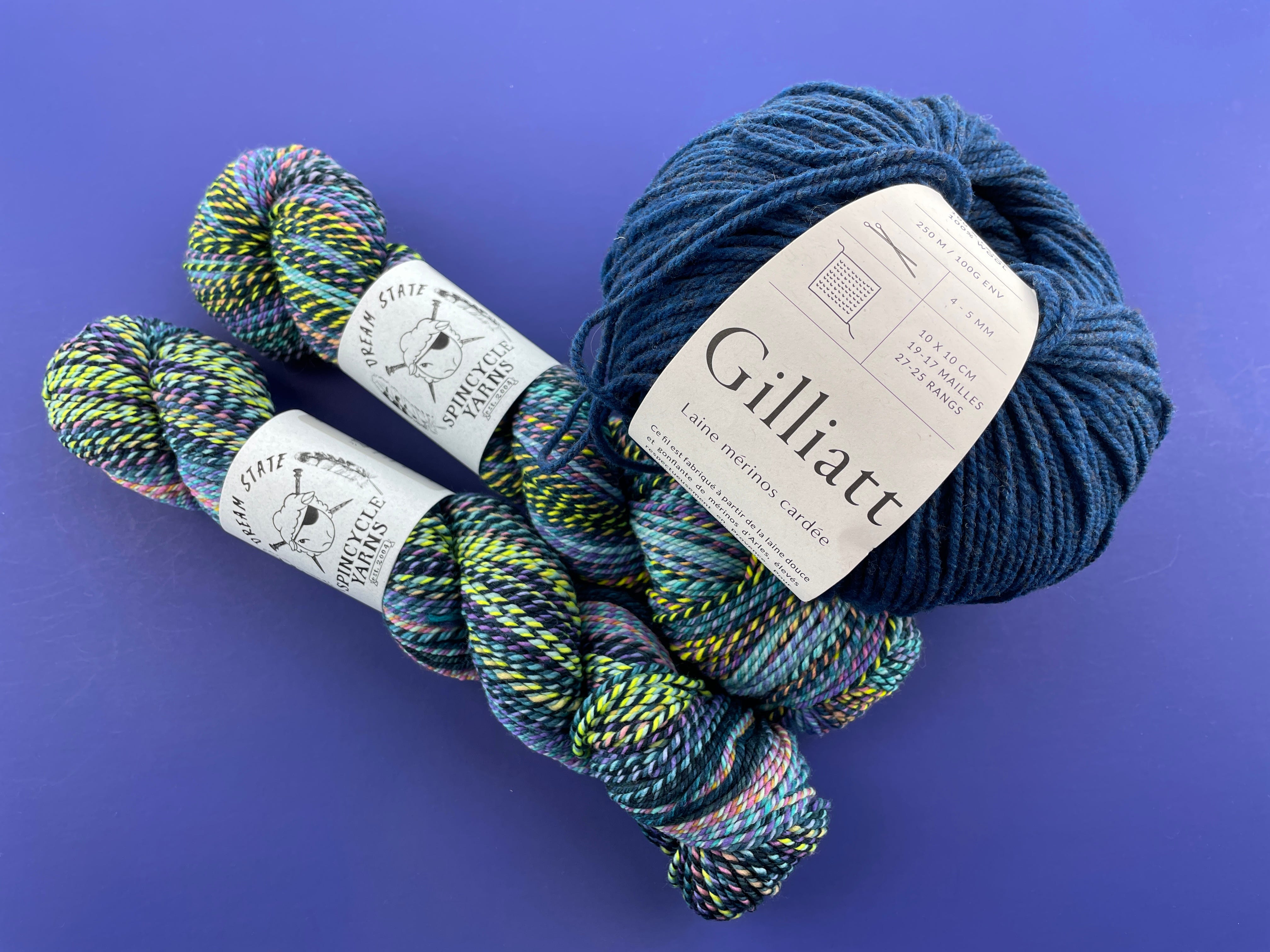
Jo and I went out and enjoyed the Rose City Yarn Crawl, and she helped me choose yarn. Look at how pretty it is!
Now I was ready to start again.
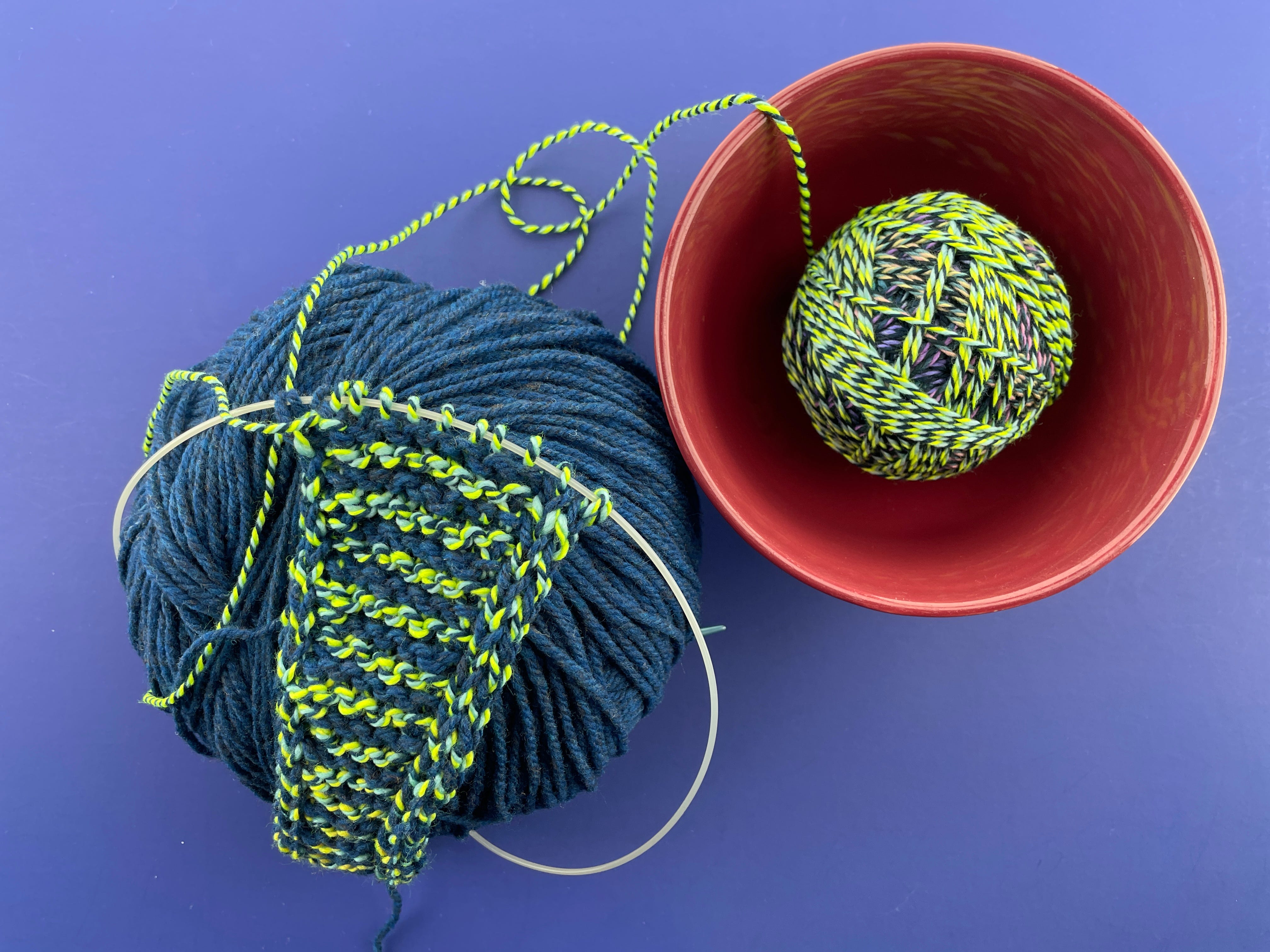
Here it is after (I think) a week.
I had to learn again how to cast on, how to knit, how to do that pretty i-cord edge, and how to change colors. I made some mistakes and had to learn how to un-knit my stitches. (It’s way harder than just pulling out crochet stitches!)
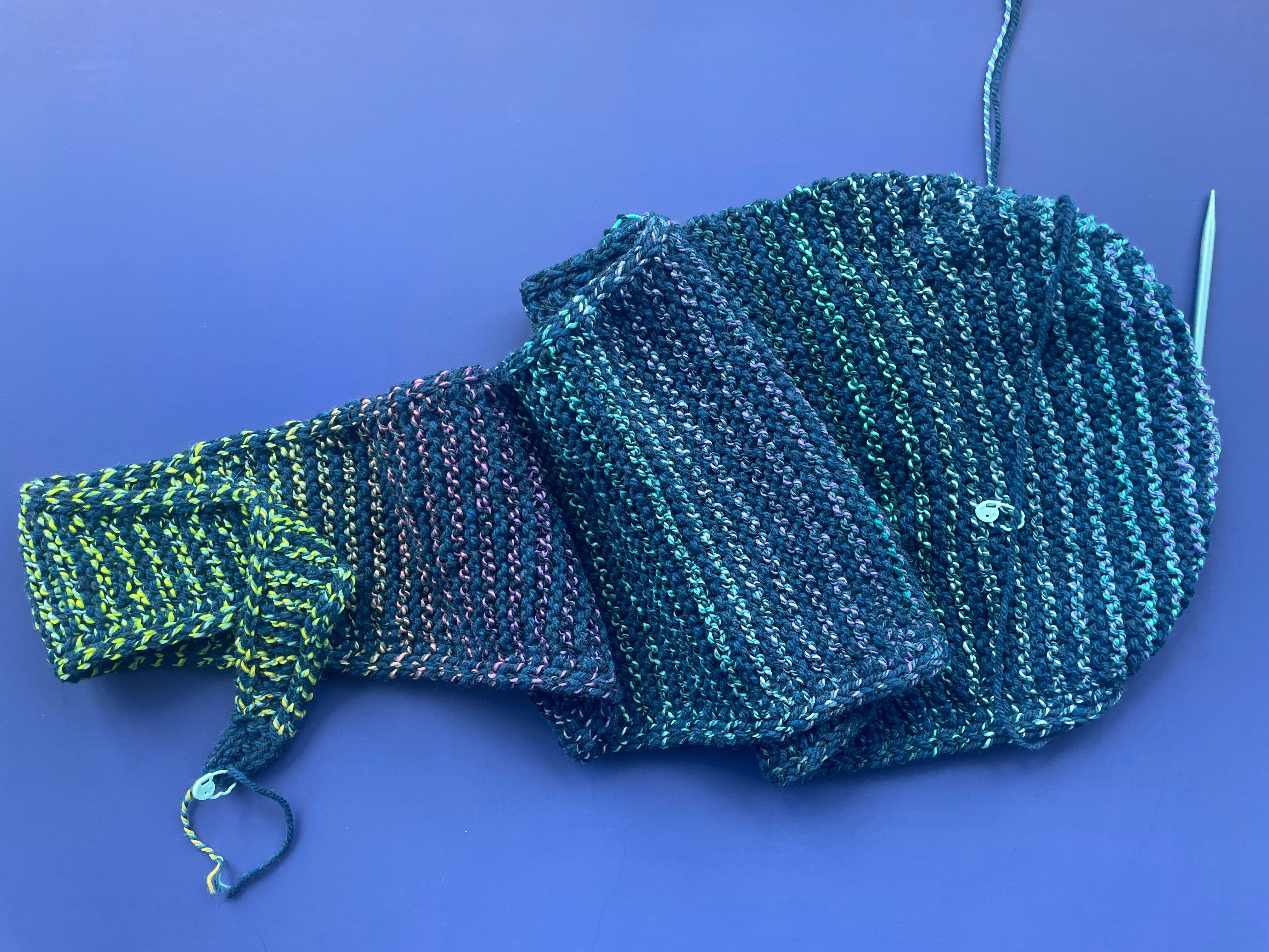
I’ve been making slow and steady progress, and now I’m halfway finished! [This was in May 2025.]
Look at those yummy color changes in the stripes!
So here’s the thing – all those things that make the project more difficult are also making it more interesting.
Yes, sometimes I forget to switch to the i-cord stitch and I have to un-knit stitches and do it the right way – but that i-cord edge looks so finished and nice! And knitting with two balls of yarn is annoying and I have to keep untwisting them, but I love the stripes! And every time my contrast yarn changes color I get a little frisson of excitement.
I’m having fun, and I can’t wait to wear my finished scarf.
A long time ago, I heard someone (I don’t remember who) speaking about kids learning to read. Learning to read is hard, and he was talking about the importance of writing books that kids will enjoy, because putting a lot of effort into decoding a boring book is not very rewarding. But if a book is a pleasure to read, the kid will be more willing to practice, and that practice will make them more proficient, which will, in turn, make the activity more pleasant, and around and around we go.
All of this is a very long way of saying that if you want to learn something new – whether it’s knitting, quilting, crochet, embroidery, cooking, whittling, playing the cello, or whatever – do it with something you’re excited about!
So that’s the end of the original post, but today I have an update. I finished it!
I actually finished it in November, but it’s taken me this long to take a picture. 😂
Here it is from the side.
And here it is laid flat.
It’s a hood with long scarf ends that come to a nice, small taper at the tips. The scarf hangs down just past my knees – long enough to wrap around my neck from front to back, and around front again.
(It was very windy out at the tulip farm and the tip of the scarf has blown to my back in the side view photo, but you can see it in the front view.)
Here’s why the Sophie Hood is a great first knitting project…
There’s no purling. The entire scarf is just knitting and slipping stitches.
The i-cord edge is super easy and gives it a real pro look – very satisfying.
Knitting has (I am learning) a kajillion different ways to increase, but this pattern uses only one. And it’s easy. And the rows when you start are so short that you get lots of immediate opportunities to practice it. By the time the rows get longer with lots of stitches between your increases, you’ve got them down pat.
I highly recommend striping with two yarns. It’s not hard, and the stripes actually helped me keep track of where I was in the pattern at all times. That was especially helpful because I’m still learning how to “read” my knitting.
For those following along in my Wardrobe Project, I’m wearing this with my new blue dress, some me-made-pants (which I’ll blog about soon) and one of my favorite kimono-style jackets.
And I’m not done knitting! Or choosing what appear to be complicated projects!
I love the look of cables, so I’m working on a vest that’s basically all cables. Here’s my swatch.
I also wanted a smaller project that’s easier to schlep around. I love the socks that Jo has knit for me, so now I’m working on a pair of socks! There’s enough weird shaping to learn for them that I just picked a simple ribbed sock pattern. I’ve finished the first one (it fits perfectly!) and I’m well on my way through the cuff of the second, so there will be more knitting to report on soon.
I’m making clothing! I mean, I guess it’s technically an accessory – but I wear it, so it counts! 🙂
Silence of the Lambs is one of my favorite movies. I’ll never turn down a chance to watch it, and I quote it all the time.
One of my goals when I started re-doing my closet was to up my t-shirt game. I have a bunch of good movie t-shirts already, but sometimes I can’t find one for a specific movie that I like…like Silence of the Lambs.
My mom designed a death’s head moth quilt pattern recently (spoiler – it’ll be released soon) And since that features on the movie poster (and also in the movie) I thought it would be a great choice for a Silence of the Lambs shirt.
This whole project was basically one huge test, so this post will be longer than the previous ones I’ve written.
I, of course, didn’t take a picture of the t-shirt before I did all of this. Hindsight is 20/20 I guess. I was able to find a similar looking shirt on google. It looked like this, but the logo was beige and gray, and also flocked.
The logo was too big to cover with the moth alone. I would either need to take the logo off, or make a backing bigger than the moth to cover more of the shirt.
First, I tried to take the logo off. I thought it might have been an iron-on, so if I heated it up with an iron again, I could peel it off. No luck. My thought process was that taking the logo off would be better than covering it because adding an additional layer of backing behind the moth might make the front of the shirt stiff, which would make it hang weird.
Once I figured out that I couldn’t take the logo off, I knew I was going to have to add the extra backing. I’ll get back to that in a bit.
I printed the moth design onto a plain piece of paper and checked the size of it compared to the t-shirt. Even though it wouldn’t cover the logo on the shirt, I liked the size of the moth in proportion to the shirt. If I wanted it bigger, I would have had to print it on two separate pieces of paper, which would have been a pain, so I’m glad the original size worked out. After that I basically followed the normal instructions for one of Mom’s quilt patterns, except I cut the pieces out of t-shirt fabric (like she did for her snail dress) instead of quilting cotton.
One other change that I made was using Heat & Bond Featherlite fusible adhesive instead of the normal Lite weight that we usually use when quilting. I did this for the same reason that I tried to take the logo off the shirt. I wanted my design to be as thin as possible so it didn’t mess with the way the shirt hung. I WOULD NOT DO THIS AGAIN. The Featherlite was fine at first, but it didn’t stick great, and peeled up a bit while I was sewing. I didn’t have this problem using the normal Heat & Bond Lite with T-shirt fabric, so next time I’ll just use that.
Just a fun heads up. I spent most of this project paranoid that everything I was adding was too thick. It literally didn’t even matter a single bit. The shirt hangs fine, and I stressed over nothing.
I fused all the moth pieces together using a light box to position them, so I ended up with the moth assembled in one piece, ready to fuse to the shirt.
Now it was time to make an extra backing that would cover the logo.
I designed the backing by just cutting an oval out of a piece of printer paper. When it was the size and shape that I wanted (the moth fit nicely inside it and the oval fully covered the logo) I cut the shape out of fusible adhesive, fused it to black t-shirt fabric, and fused the moth to the oval. I thought about not putting fusible adhesive on the back of the oval, but I wanted it to be stabilized – both for sewing the moth to it and then sewing it to the shirt. I was worried that if I didn’t put the adhesive on the back that when I sewed the moth on it would stretch the backing oval out of shape. Same for if I sewed the oval to the shirt with no adhesive behind it to stabilize.
In the end, the front of the shirt turned out really well, so I think I made a good call by putting the adhesive on the back of the oval.
Time to do the outline stitching.
I sewed the outline of the moth in an orange and yellow variegated thread. Since the moth is mostly gray, I wanted to add a little pop of color. I was also inspired by the movie poster, which has both orange and yellow.
I did three passes with the outline, just like on our quilt samples. It made a nice bold outline, and I think it turned out really well.
I kept the paper backing on the oval when I sewed the moth to it. I will warn you that sewing through the paper WILL dull your needle. If you do what I did, you should change your needle after. I didn’t, and it came back to bite me. Learn from my mistakes.
After I sewed the moth to the oval, I peeled off the backing paper, fused the oval to the shirt, and sewed it down with a zigzag stitch. I did this instead of a straight stitch because I didn’t want the edges of the oval to curl up, which would have happened with a straight stitch after a few washes. Since they’re both black fabrics, you can barely see where I sewed the oval to the shirt.
Now that I was done with the front of the shirt, it was time for the back. I was inspired by a Swoodson Says post about ransom note letters from old t-shirts. I followed her instructions pretty much to the letter (no pun intended). It’s pretty easy. Just fuse Heat & Bond to the back of the t-shirt. Make sure to leave a margin around the letters. Then cut them down to size, peel the backs off, fuse them, sew them down, done!
This was my first time trying this out, and I learned a lot. Sometimes it’s hard to get the fusible adhesive completely on the back of the letters – especially if the word is curved. It’s crucial to have adhesive on every corner of the letter. This will save you grief later.
I also found that letters with a black background were harder to sew to the shirt because I couldn’t really see the edges. If you’re not sewing black letters onto a black t-shirt, I think you’ll be fine.
I laid my letters out on the back of the shirt, and fiddled with them until I liked the placement.
I peeled off the backs and fused the letters down.
USE A PRESSCLOTH FOR THIS.
I should have, but I didn’t at first and the letters left a residue on my mother’s iron (don’t tell her). Use a presscloth just to be safe. And if you get something sticky on the iron, use a used dryer sheet to wipe it off the hot surface.
Once everything was fused down, I got to sewing. I opted for black thread for all of them. I thought that using the same variegated thread that I used on the front would make the back too busy, and color matching all of the letter squares would make me crazy.
I tried out just one outlining pass with the black, but it looked too thin for my taste, so I went ahead and did three passes like I did on the front of the shirt. When I started sewing the letters, I did three passes on one and then moved on to the next, did three passes, and so on. I wouldn’t recommend that, and I stopped doing it after the first word. I would recommend giving each letter a single pass. I really had to wrangle the t-shirt a lot to go around the small letters, and all that movement made the corners of some of the other letters peel up. I felt much more secure after I got a single pass of outlining on all the letters – then I could wrangle without worry.
Hey, remember how I said to change out your needle after sewing through that paper earlier? And also how I said that I didn’t do that? Yeah, now is the time that I learned my lesson. On my first pass on some of the letters—specifically ones with cheaper t-shirt fabric, or ones without adhesive in every corner—the machine sucked them down. This was totally the needle’s fault. It wasn’t piercing all the way through, instead pushing the t-shirt down into the bobbin area and making a huge mess. There are at least three letters that this happened to before I realized that I needed to change the needle.
It’s a bit hard to tell in the photos, but the places where the outline gets wonky are the places where the machine sucked the fabric down. Those spots are a hard knot of thread behind where the fabric bunched and the feed dogs didn’t get a good grip. If this happens to you, don’t try to seam-rip it. There’s a very high chance that you’ll end up ripping the fabric instead of the thread. My advice is to leave the snarl, but try your best to flatten it on the next pass by pulling the t-shirt tight, and basically pulling it through the machine so that it doesn’t have a chance to get stuck in the same place.
Once I got all the letters sewn down (which took like 2 hours of my Dune audiobook), I ironed the back again to set the stitches. Make sure to use a presscloth again.
Then I was all done!
Here’s the front…
And here’s the back…
In hindsight, I would have moved the letters over to the right a bit. I wanted them as far left as I could make them, but when I wear the shirt, I find that the first letters of the words disappear a bit.
Even though there are things I would change on the next project, I’m really happy with how this shirt turned out. I’m already thinking ahead to what other movies I could make shirts for. Maybe a bee for Candyman? Or a syringe filled with glowing green liquid for Re-Animator? If anyone else does a project like this, I’d love to know. There are so many possibilities!
I’ve never been a dress wearer, but I can’t stand things that are tight around my waist, and I thought a loose dress might be comfortable AND look batter than my sad yoga pants/tank top/cardigan uniform.
I was right! The loose dresses I bought are super comfy. I’ve been layering them up all winter, and I’m looking forward to a cool, breezy summer in them.
My next step was to make my own dress. I fully intended to trace this purple dress.
It’s pretty clever, with ties in the front and back so you can tie the dress multiple ways. Go to the listing and watch the videos and you’ll see.
So I bought the pattern and made one!
I… don’t love it. I want to love it! But I just don’t.
The ties are cool, but they kind of annoy me when I’m wearing it, and I don’t think I really want the slight waist shaping. The sleeves are ok, but I wish they were longer, and just a touch narrower (especially at the armholes) so they’ll fit better under my kimono-style jackets (some of the very few things I already own that I actually like).
The construction is BRILLIANT, with a clever technique that leaves nice, clean finished edges with no fuss or binding. The instructions are GREAT, with videos showing the whole process. A beginner can definitely make this.
The thing I really don’t like is the neckline. Because of the way the dress hangs from the shoulders, the neck spreads much wider than I like. Also, I really like to wear scarves, and it’s crazy annoying to have bare neck between the bottom of the scarf and the top of the back neckline. 🙁
These are things that will not be dealbreakers for most people, but for me they are. I’ll be tracing that purple dress soon so I can try to duplicate it. 🤞🏻
But before I move on, I have to show you the applique I added to this dress – because that was a huge win!
I made the dress out of a dark blue linen blend – fine, but kind of boring. That’s the perfect recipe for adding a little fancification!
I decided to applique Sullivan Snail and the simplest of the Wild Flowers all around the bottom of the dress.
The dress looks gray here, but it’s actually dark blue. I photographed it in a really bright light so you’d be able to see the stitching as clearly as possible.
I’m thrilled with how they look! I’ve worn and washed this a number of times, and the applique has held up really well.
Instead of using quilting cotton, I used fabric from a stack of t-shirts I bought at the thrift store. I just wanted to try something a little different! By using t-shirt fabric I’m eliminating any fraying (knits don’t fray) and if the edges curl up a bit, it’s the same color on the back so it doesn’t matter.
I did my usual three rounds of all the outline stitching, but I did it in matching or slightly contrasting thread instead of black. Right-click on that image to open it in a new tab and you can really zoom in for a close-up.
The only thing I’d change is to make the snail a little smaller. Just a little. 🙂
So, all in all this project gets mixed results.
The dress pattern was well-designed and sewed up easily, but ultimately the shape isn’t for me. It’s fine and I’ll keep wearing it! It’s just not my favorite.
The applique gets an A+. I’ll definitely be doing more of that, on lots of different projects. I’m designing some things right now to applique on a men’s sports coat I thrifted, and Jo’s working on some appliqued t-shirts.
You can find all the posts in The Wardrobe Project here.
This week I’m upcyling a sweater to change the color.
A few months ago, my grandmother gave me a sweater that she made but doesn’t wear anymore.
I liked the fit of it, and I especially liked the lacy sleeves. I’m always overheating in full sweaters, so sleeves with a little more breathability are nice. The only thing I wanted to change about it was the color. I really only wear black clothing, or the occasional dark color or neon color. I don’t really wear earth tones. I thought that this sweater would be a great chance to try dyeing something. Despite the many many times that I’ve dyed my hair, I’ve never dyed my own clothing.
Since I didn’t make this sweater, I didn’t know what it was made out of. It felt like acrylic, but I still wanted to test it to make sure. (The fiber content will determine what kind of dye to use.)
I used a lighter, and held it against one of the loose tails on the inside of the sweater. It melted, and made a little hard lump at the end of the thread, so I knew it was acrylic. If it had been wool or another natural fiber, it would have burnt, and made a small bit of crushable ash.
If you’re doing this at home with a store-bought piece that doesn’t have any tails on the inside, hold the lighter against a bit of one of the inside seams. Try to pick a place that won’t rub against your skin, because if it’s acrylic and you melt it, it’ll be a bit rough.
Once I determined that it was acrylic, I went out and bought some synthetic dye. I used Rit Synthetic in the color graphite. (#NotSponsored)
I was a bit worried that it wasn’t going to be black like I wanted, because graphite is more of a dark gray. I went to two different places that were pretty well stocked with Rit dye, but I didn’t find any synthetic dye that was specifically called “black.” I mention this now because—spoiler—it’ll be a thing later.
I basically just followed the instructions on the bottle. It says to wash the clothing first to get rid of any fabric softener. It also says to wet the fabric before putting it in the dye bath. I was able to kill two birds with one stone. I took it straight out of my washing machine and added it to the pot.
Speaking of the pot. It didn’t say this on the bottle, but I’ve read that you’re not supposed to use a pot that you’ve dyed things in for food. I went out to a thrift store and bought the biggest soup pot they had. Now it’s going to live on as my designated dye-pot.
I simmered the sweater for about an hour, and then rinsed it in my sink until the water ran clear. Surprisingly, the dye didn’t stain my sink gray, but your mileage may vary. The instructions said to either wash the piece by hand or put it into the washing machine with an old towel. I opted for the washing machine and old towel, but I regret it now. In hindsight, for a hand-knit piece like this, I really should have hand washed and laid flat to dry. Being in the washer with just a towel was too aggressive, and it stretched the sweater out of shape and made the edges pill a bit. (A shame, because I don’t think the sweater had been worn before this.)
I popped the sweater in the dryer to try and shrink it back a bit. It worked, and confirmed that I was right about it being acrylic, but the collar was still wobbly and out of shape.
Also, when I pulled it out of the dryer, I saw that it was gray, not black. It looks…like graphite, so I guess the bottle wasn’t lying.
I tried to re-wet just the collar of the sweater so I could re-block it and try and fix the wobbly collar. It didn’t work great, but I’ll try it again with pins to hold it in place instead of just laying it out.
Enjoy my photobombing dog, Fozzie, in this picture. He loves to check out any clothing that I leave unattended, especially if I lay it out on my bed like I did for this picture. 🙂
All in all, the color isn’t bad. It’s not the black that I was hoping for, but it’s a nice gray, and I do think I’ll wear it (if I can fix the collar). Honestly, the dyeing process was so easy that I’m already planning to dye more things from my closet.
I introduced The Wardrobe Project here (with Jo’s intro here).
Today I have my first step towards a solution. It’s kind of lame that it involves a purchase instead of making something, but this was actually a really good place to start.
For those who haven’t read the original post, my main problem is that I have very few clothes to wear, and I end up wearing the same black yoga pants, black tank top, and black cardigan every single day.
Snooze.
I bought some clothes! Colorful clothes! That (mostly) checked all my boxes.
They’re (mostly) comfortable.
I can wear them in layers.
They’re colorful, but not clownish.
They seem to be well made? I’ve had them for a few months now and I always hang to dry, but one shoulder seam on one dress is already popping open. It was easy enough to repair, and hopefully it’s a fluke.
They’re mix and matchable.
I did a TON of Google searching and eventually ended shopping at Gudrun Sjödén.
When I did the overview of what’s in my closet, I realized I owned NO dresses. None. Since I don’t like things to be tight around my waist, that seemed like a huge missed opportunity – so I deliberately went looking for dresses! I was hoping to find a dress I would like as is, with bonus points if it was a style that would be simple enough for me to copy – or at least to use as a guide when sewing my own.
I’ve tried sewing my own clothes before and it’s sooooo frustrating to spend all that time and money and end up with something that just doesn’t look good! Which you don’t really know until you’re finished. 😩
I thought if I could start with a ready-made dress I like, I could at least say, “I like this length. I like this much ease in the bust. I like this much ease around my hips. I like this kind of neckline.”
I also don’t like to have bare legs, so I was looking for pants or leggings to wear with those dresses.
I LOVE the Gudrun prints, but a lot of the garments I tried just didn’t look good on me. The knits were soft and comfy, but I didn’t like how they looked without a bra, and they tended to cling to each other when I tried layering them. The cotton dress I tried felt flimsy and kind of cheap – but the linen! The linen dresses were great! They were light and cool enough for summer, and layerable for cooler weather.
I bought two! One blue and one purple. And I bought leggings and linen pants in purple and blue too, so I could mix and match a bit.
You can see the purple dress and leggings in the top photo.
And look! The purple linen pants look great with the long purple cardigan I already had! (Plus one of my many identical black tank tops.) Yay for making something I already own more wearable!
And here’s the blue dress with the blue linen pants.
I love the look of the pants with the dress, but right now the leggings are more comfortable. (Leggings are usually too tight to be really comfortable for me, but these aren’t bad at all.)
The pants would be better if the elastic waistband was just a little bit larger. The band is stitched through a few times – which is great to keep the elastic from twisting, but not great if I want to unpick it to replace with slightly longer elastic. 🫤 I’ll probably do it for these that I already have, but I don’t think I’ll order more in the future. They’re also a little wider in the leg than I’d choose, so I probably won’t try to copy them.
But the purple dress is simple enough that I think I can copy it!